Consistency
My Thoughts on Style Consistency
This article was supported by Patreon! If you like what I’m doing here, consider supporting me there :)
The “sacred rule” of pixel art dictates that you shouldn’t mix resolutions, and for a good reason: combining sprites of different resolutions can result in an amateurish and confusing appearance. The primary strategy for developing a pixel art game is to choose a resolution and stick to it. Sounds simple enough, right? Well, not quite.
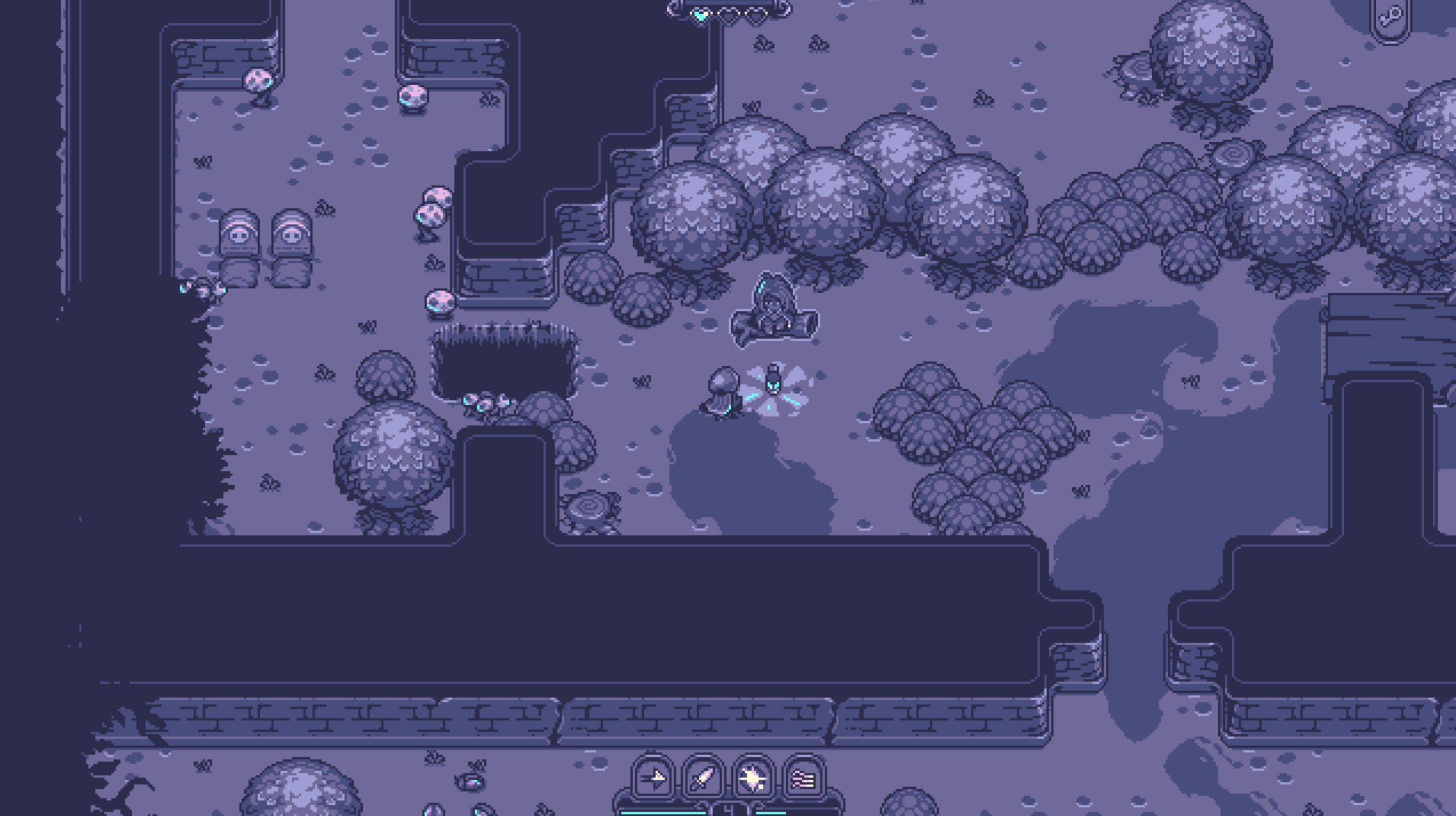
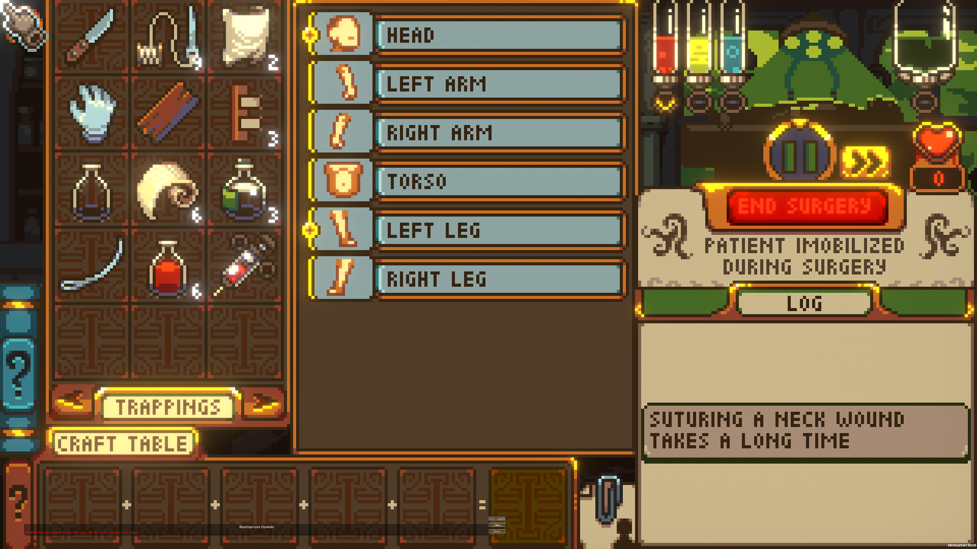
Although I’m a big advocate for pixel art consistency, I also made a game that looks like this:
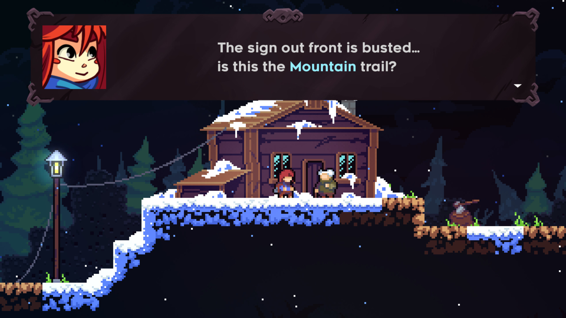
Designing user interfaces, maps and portraits can be extremely challenging in very low resolutions, especially if you plan to localize your game or if you have a particularly restrictive set of limitations (low resolution, low color count).
While there is no one-size-fits-all solution, we can discuss some possible approaches. Let’s explore our options.
- Full Consistency: Bite the bullet and do everything at the same resolution. This can save you a lot of time, since pixel art is usually faster and more forgiving than HD, however be prepared for really challenging limitations.
- Chaos: Throw the rulebook out the window and just mix everything everywhere. Can this possibly work? If you really know what you’re doing, yes, it can.
- Keeping World Consistency: My go-to approach. You can get away with mixing styles if each area of your game is kept separated and internally consistent. Let’s talk more about this.
Types of Consistency
When you start a project, you usually must decide what limitations and which types of consistency you will have. The main ones I’ll discuss are resolution, colors, and stylistic.
Keeping Resolution Consistency
Contrary to what some people might think, pixel art games, in most cases, shouldn’t scale their sprites to draw them on the screen. The main technique used nowadays is to draw the sprites to a canvas at the original resolution and then scale that canvas to fit it to the screen resolution.
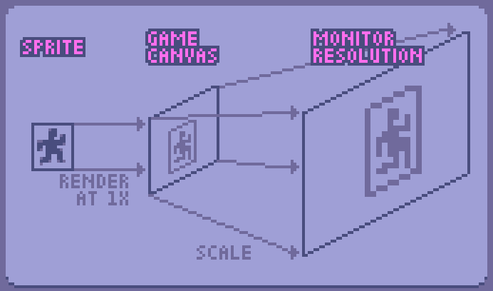
The first step for this is to choose a base resolution. On Celeste, for example, I chose 320x180. That’s what I call my game canvas. The game canvas is where the sprites will be drawn and has the size of your camera. It’s a good idea to choose a canvas that can be easily scaled to your main target platform. The Nintendo Switch resolution is 1920x1080, and if you multiply 320x180 by 6, you get exactly that. This is important because when you rescale pixel art to non-integer resolutions you can get a jagged image.
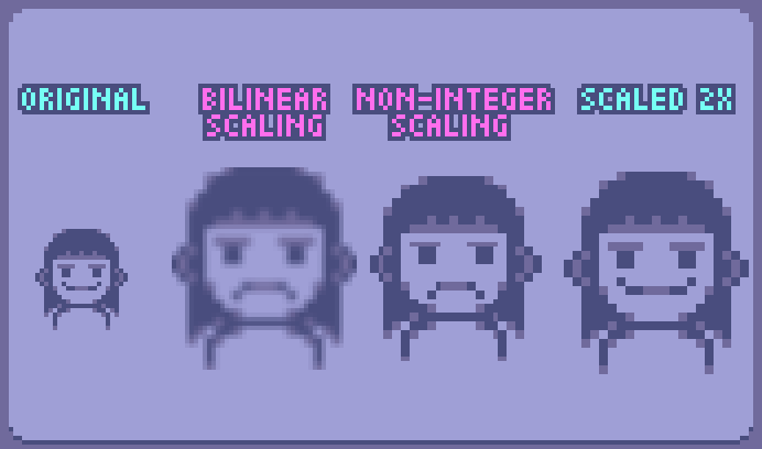
Also remember, if you scale you screen to an integer number (2x, 3x, …) you don’t lose anything, as long as you use nearest neighbor interpolation (also known as point interpolation). Never use any smoothing algorithms for scaling pixel art, unless you know exactly what you are doing.
Scaling Sprites
You can, alternatively scale your sprites to the screen resolution. While this is usually not ideal and may cause several problems down the line, it may the only option you have depending on your game, especially if you plan to rotate sprites a lot. Here are some tips to mitigate some of the undesired effects:
- Scale all sprites by the same integer number.
- Snap their position to
position * gameScale - Consider rotating sprites at their native resolution if it fits the style of your game
- Avoid drawing anything smaller than 1 pixel to the game screen
Dealing with different screen sizes
This is all good in an ideal world, but unfortunately, things are rarely this simple. TV and monitor resolutions and aspect ratios vary significantly, and while we can’t cover all cases, we can try our best. Sometimes we can’t scale our canvas to an integer number, so what can we do? Here are some possible solutions.
Change the camera size
- Scale the canvas to the closest integer size and round it up
- Draw it to the screen, cropping out the extra pixels
The downside of this approach is that people with different monitors and resolutions might see more or less of your game world. If you don’t care about that, this is great since you can get really sharp and good-looking pixel art with this. Just make sure to test many edge cases to ensure you don’t end up cropping too much or too little.
Scale up, then down
- Scale the canvas to the screen resolution and round it up
- Scale down that canvas to the screen resolution (filling the screen)
This is useful for games where the camera size is crucial. You might want to experiment with scaling it down using bilinear or trilinear interpolation, which might yield better results.
Letterbox It
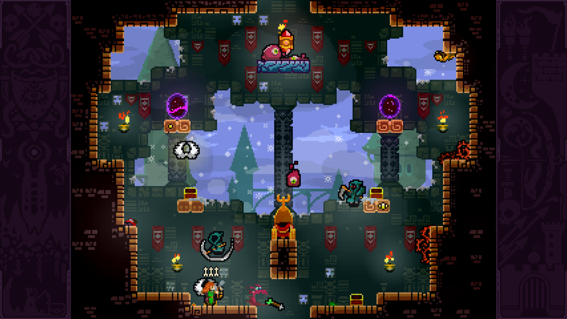
- Scale to the camera size and round it up
- Place attractive letterboxes around it
This is useful if you really want to have very sharp and nice pixels, but also can’t change your camera size for gameplay reasons.
Mix Things Up
Often, your solution is to combine two or more of the methods mentioned above. You may Letterbox it but fit your game to the screen height or width, or you may Scale Up then Down. Just make sure to test the edge cases; don’t underestimate the unusual resolutions people might use.
Embrace the Jaggies
If your game is intentionally quirky, just scale it to the screen size and embrace the jaggies.
Color Consistency
Maintaining color count consistency is crucial in pixel art and is often underestimated. Most people think that this means having a limited palette, and while that can be true, it’s only one aspect of keeping color consistency.
Sticking to a low color count is the most common way of maintaining color consistency: you simply limit your available colors to a set number. The cool thing about this is that it’s a “fire and forget” limitation; you only have one palette, and every time you draw, you load up that palette and you’re good to go.
This is especially interesting for retro games but can be used to great effect in more modern games as well.
As you can see here, I usually don’t aim for the “retro” look, so even though I keep the color palette fixed and limited in this game, I add post-processing that ignores the palette to the screen canvas. Just like scaling, you usually can get away with breaking your consistency after placing sprites in the canvas.
When working on games without a limited palette, it’s good practice to keep commonly used colors easily accessible for reuse. The main issue with having too many colors is that every time you introduce a new color to the game, there’s no real reason not to use that new color everywhere you can - and that includes other sprites. It’s a bit counterintuitive, but the most common color inconsistency in games without color limitations is that some sprites don’t use colors that they could be using.
Keeping World Consistency
I like to think of the game elements as different “worlds”. The menus, the user interface, the game canvas - they all can be considered separate worlds, and you can exploit that. Each element, or world as we will refer to them from now on, is there to solve a problem, and we must choose the style that best solves that problem.
In Celeste, we designed 3 worlds with distinct styles: Game, UI, and Map. Pixel art, high resolution, and 3D, respectively.

The trick here is the quarantine; styles never leak from one world to another. When you pick up a crystal heart in the game world, you see it as a pixel art sprite. Then it shows up in your user interface as a high-resolution sprite, and later you can see one on the map in 3D. It would be very jarring if the heart pixel sprite appeared in the user interface. The major downside of doing this is that we had to draw it three times.
Another interesting example was while designing Earthblade, a game with pixel art gameplay and high-resolution user interface. We had an icon floating above a character’s head to show a status. I intuitively drew it in pixel art since it follows the character around, but then I stopped and thought about the implications of that. A pixel art icon floating above the character’s head would mean that the character would have an in-world icon floating above his head! Since this is a non-diegetic piece of information, I had to redraw it again, now in high resolution.
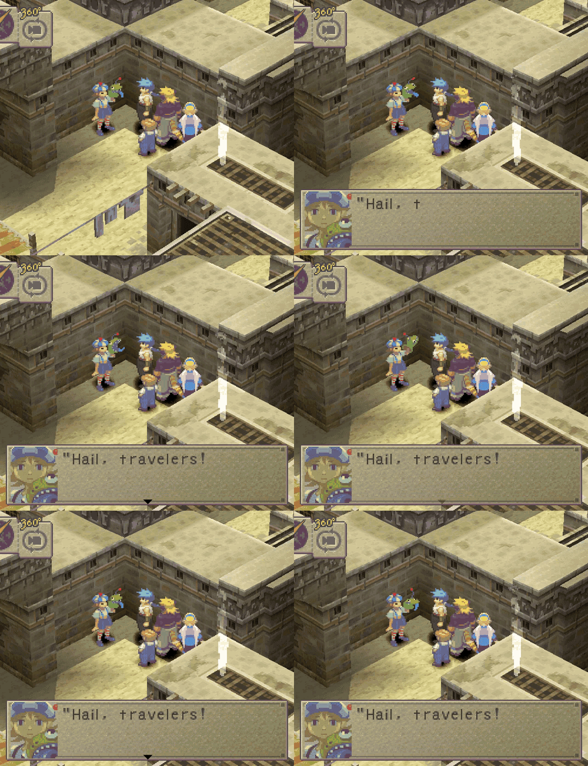
Again, it’s all about intent and following the rules you set for each individual design element. You can get away with a lot of style mixing and leaking just by having high quality art, Breath of Fire 4 is one of the most gorgeous games ever made and mixes pretty much every style and resolution possible in a single frame.
Common Problems
Here are some solutions to common problems that I encountered while dealing with pixel art resolution and color consistency.
Layer Sliding
Sometimes, especially when dealing with a low resolution and parallax (or other slow movement), the pixel grid’s minimum movement might look weird. One way to solve this is to split things into layers. Draw sprites to different game canvases, all with the same resolution, and then slide those layers using the screen resolution.
![]()
As you can see in the image, even though it has consistent pixel size, the position is using a higher resolution. The problem now is that this creates those “thin pixels”, that exposes your higher resolution. If this is during an animation or movement, this is usually less notable. This is why I make the pixel layers always stabilize in integer coordinates when it stops.
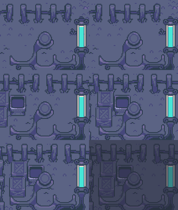
As you can see here the image moves at a higher resolution, but always stop at the correct pixel position.
Rotating Pixels
Rotating pixel art is always a challenge and is probably one of the most common problems when working with pixel art. Rotating 90 degrees almost always works, and sometimes you can get away with 45 degrees; anything else is usually… questionable. While there’s no definitive way to solve this, here’s a list of partial solutions for this problem:
- If you can afford it, you may try redrawing the sprite in as many directions as you can, and then rotating it to the angles in between.
- If you can’t, you might consider drawing the rotating sprite at the screen resolution; this means you scale the sprites, instead of the canvas. There are many downsides for this, the big one is that the pixels will look like rotated squares, which usually is very inconsistent.
- And finally, you may just rotate it at native resolution; this works well if it’s a fast movement or for larger sprites, not so well if you plan to keep your sprite in the rotated state.
Camera Jitter
You may notice that if your game uses a low resolution, your camera can only move 1 pixel at a time, and this might look weird, even more so when the movement is slow and diagonal. To solve this, I let my camera move at the screen resolution, not at the game resolution. To achieve this:
- Your game canvas needs a bleed area; make it a few extra pixels larger than your target resolution.
- Render your game sprites normally, snapping to the pixel as usual.
- When drawing your camera to the screen with the offset:
gameScale * ((float2)camera.position - (int2)camera.position - BLEED_SIZE / 2). It looks intimidating, but you are just adding what you rounded off from the camera position back into the screen position.
Conclusion
Like anything in art, when we talk about consistency and limitations, intent is key. As long as you follow the rules you set (or break them with intent), you have the freedom to create anything you want. When in doubt, strive for maximum consistency. If you’re well-versed in the rules, you can always choose to break them deliberately for a specific effect or purpose.